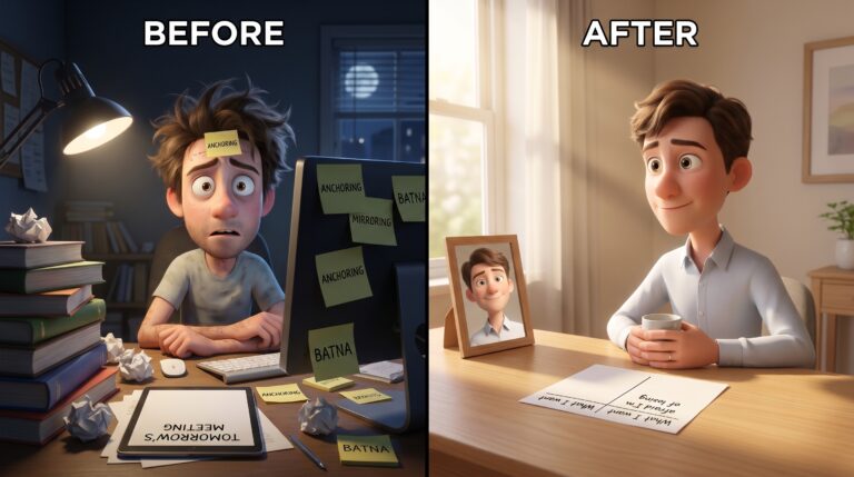
Most pitch decks fail because of how they’re built, not what they contain. The information is right. The logic holds.
The room disengages by slide four. The standard response makes it worse.
Why Does Adding More Visuals Make Communication Worse?
Adding visuals to a failing presentation makes it worse. The problem is not aesthetic. It is cognitive.
When communication fails, the instinct is to add visuals. Open Canva. Add a handshake image to the partnership slide.
Replace bullet points with icons. You have made it more visual. You have not made it more persuasive.
This approach treats communication as an aesthetic problem. The real issue is cognitive.
A stock photo of a handshake does not help anyone feel anything. It is furniture. It takes up space without doing work.
Every forgettable presentation trains your audience to stop paying attention. Audiences ignore great ideas in unmemorable packaging. Not because the idea was wrong — the brain has nothing to hold.
The fix has nothing to do with design tools. It starts with how you think about the idea before you touch any medium.
What Does Brain Science Actually Say About Visual Persuasion?
When an idea hits the verbal and visual channels simultaneously, it encodes more deeply. That is the mechanism.
Allan Paivio called this dual-coding. Two channels: verbal (words, logic) and visual (images, scenes, space). Activate both simultaneously — the idea sticks.
It moves from “something I heard” to “something I experienced.”
Concrete images activate episodic memory — the same system that stores lived experiences. The idea stops being a fact you heard. It becomes something that happened.
This is why you remember your childhood kitchen in detail but not the third paragraph of yesterday’s article. Your brain encoded the kitchen as a lived spatial experience. It processed the paragraph analytically — then discarded it.
When you use a concrete metaphor or vivid scene in your communication, you are not decorating an argument. You are routing the idea through a different memory system — one built for retention, not analysis.
The goal is not to add images to your ideas. The goal is to make your ideas imageable. A well-chosen metaphor does this.
A specific scene does this. A stock photo of a lightbulb does not.
The Reveal: Decoration vs. The 20% That Actually Works
Here is the pattern: collect information, build slides, find images that “represent” each section, polish the design. The result is decoration — visuals sitting beside content without clarifying it.
The cost: Richard Mayer’s 2001 study pegged audio-only retention at roughly 10%. Paired with a relevant image, retention climbs toward 65%. But the word is relevant — a communicative visual, not a decorative one.
20% of visual choices drive 80% of audience retention. They share one property: these choices map to the structure of the idea.
They make the abstract concrete. Remove them and the audience loses understanding — not just production value.
Here is the move: before opening any design tool, ask “What physical object or situation does this idea resemble?” That question separates communicators who move people from those who merely inform them.
The Visual Logic Framework: A System for Imageable Ideas
I built pitch decks this way for two years. Polished. Logically correct.
Consistently ignored. The problem was not the slides — I had never translated the idea into something the brain could hold. That is the one move I would have made sooner.
I call this approach the Visual Logic Framework. It runs in three steps before you touch any medium.
Step 1 — Scene filter. For any abstract idea, generate five physical scenes it resembles. The first is usually a cliché.
Wait for the second or third. You want specificity: objects, space, movement, consequences.
Step 2 — Concreteness test. Can someone draw your metaphor from your description?
If not, it is still abstract. Translate further until you reach something physical and specific.
Step 3 — Communicative test. Remove the visual or metaphor. Can the audience reconstruct the full meaning without it?
If yes, it is decoration. If no, it is communication.
I ran this framework on a consulting proposal I was building for an SMB client last quarter. The proposal covered three service tiers. The abstract framing — “strategic, tactical, and operational support” — was accurate but flat.
Running the scene filter produced this: a GPS system with three modes — route planning, turn-by-turn, and real-time traffic rerouting. The client signed at the highest tier. The scene made the value ladder legible in a way the category labels never did.
That is a minimum viable experiment with the framework: one deliverable, one scene filter pass, one specific result. The test took twenty minutes.
How Do You Apply This Without Design Skills?
The Visual Logic Framework works in writing just as powerfully as on slides. The brain’s visual channel activates through specific language — not photographs.
Compare these two sentences on the same concept:
“Effective leaders communicate with clarity and purpose.”
vs.
“She walked into the room. Wrote one number on the whiteboard. Sat down. Nobody needed the other forty slides.”
The first is correct. The second is a scene. You saw the whiteboard.
You saw the room. Your brain encoded the second sentence as something that happened — even though it only happened in text.
The gap between vivid writing and flat writing is not vocabulary or structure. It is the ratio of concrete scenes to abstract claims.
Test every key sentence: can the reader draw it? If not, it is still abstract. Translate until you have a physical scene — objects, actions, space, movement.
That is where writing becomes persuasive rather than merely informative.
Solo builders writing blog posts, cold emails, and pitch documents: you cannot out-design a funded brand. Not with a full creative team. You can out-specify them.
Specific, scene-based writing consistently outperforms polished-but-abstract content. The constraint is an advantage.
Does Visual Storytelling Require Images at All?
No. The headlights example makes this concrete. A product builder was pitching a workflow bottleneck-detection tool to a skeptical stakeholder.
The stakeholder’s objection: “We already have metrics dashboards for that.”
She had a logical case — faster diagnosis, fewer meetings, time savings. It was not landing. So she stopped.
“Imagine you are driving at night. Your speedometer tells you how fast you are going. What it cannot tell you is that there is a deer on the road.
Our dashboards are the speedometer. This tool is the headlights.”
The conversation changed in ten seconds. No slides. No design budget.
One physical scene every driver has lived. The abstract concept — proactive bottleneck detection versus reactive monitoring — became immediately felt.
That is the full stack: think visually first. Map the abstract to a physical scene. Express it in whatever medium you are working in.
Why are visuals more persuasive than words?
The brain processes information through two channels: verbal (language and logic) and visual (images and scenes). Allan Paivio’s dual-coding theory shows that activating both channels simultaneously encodes information more deeply. Concrete images trigger episodic memory — the system that stores lived experience. The idea becomes something that happened, not something argued.
This is why people retain 65% of information paired with a relevant image versus 10% from words alone.
Does visual storytelling work in writing, without actual images?
Completely. Specific, scene-based language activates the visual channel just as powerfully as photographs. “She walked into the room, wrote one number on the whiteboard, and sat down” creates a visual experience.
“Effective leaders communicate with clarity” does not. The test is simple: can the sentence be drawn? If not, it is still abstract.
Scene-based writing consistently outperforms polished-but-vague prose in both retention and persuasion — especially for solo builders without design resources.
Where does visual persuasion become manipulation?
When an image accurately represents the underlying idea, you help people understand faster. That is a service.
When the image manufactures an emotional response the logic does not support, you are exploiting the cognitive machinery. Fear or urgency the facts do not earn — that is the manipulation zone.
A communicative visual clarifies what is true. A manipulative visual manufactures what is felt. The line: does the image make the real idea clearer, or does it substitute feeling for evidence?
Every communicator building for trust needs to hold that line.
Is “Think Visually” Enough, or Is There a Repeatable Protocol?
Apply the Visual Logic Framework to the next thing you create — a post, a pitch, an email, a conversation.
Step 1: Identify your single core idea. Not three ideas. One.
What is the thing that makes this communication work if the audience remembers nothing else?
Step 2: Run the scene filter. Ask: “What physical object or situation does this idea resemble?” Generate five options.
Wait for the second or third. You want specificity — objects, space, movement.
Step 3: Test for concreteness. Can someone draw your metaphor from your description? If not, translate further until you reach something physical and specific.
Step 4: Lead with the scene. Whether writing, speaking, or building slides — open with the scene. Let logic follow the image.
The audience needs the felt sense before the argument lands.
Step 5: Filter everything through the scene. For every sentence, slide, or data point — does this deepen the scene and add meaning? Or does it add cognitive load without adding clarity? Cut anything that increases load without increasing understanding.
The communicators who move people are not doing anything exotic. They translate abstract ideas into physical reality before writing a word. The pitch, the post, the cold email — all of it becomes easier once the scene is in place.
The scene does the heavy cognitive work so the structure does not have to.
Start with the scene. Build everything else after it.