Most advice on color psychology hands you a cheat sheet. Red means urgency. Blue means trust. Pick your palette.
Conversion follows. That’s the promise.
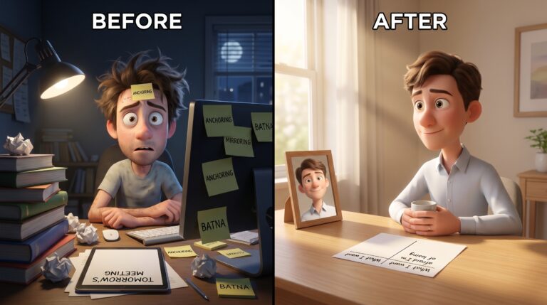
I picked blue for trust. I spent two weeks redesigning my landing page — contrast ratios, button colors, palette testing.
Signup rate didn’t move. Not a single point.
The cost was two weeks of shipping time. More importantly, I was wrong about how color works. It doesn’t carry fixed meaning.
Color meaning shifts with context, category, and brand history. No single association survives contact with a real page.
Here’s the 20% I wish I’d known: the same system targets you too. The real question isn’t “what color converts.” It’s two questions: what’s the game, and how do you play it from both sides?
Why Color Cheat Sheets Fail in Practice
Cheat sheets fail because color meaning is contextual. The same blue that signals trust on a banking app reads as cold on a wellness brand.
Category norms, brand history, and surrounding design shape color meaning. Not universal psychology.
Mehta and Zhu’s 2009 study found real color effects on cognition. Red primes avoidance-oriented thinking — detail focus, careful analysis. Blue primes approach-oriented thinking — creativity, openness.
That’s the actual finding. Articles flatten it into “red means urgency, blue means trust.”
Take a real example. ING Direct relaunched in 2000 with orange as the primary brand color. Orange was not a “trust” color.
The conventional wisdom said banks need blue. Customer acquisition went up in the 18-35 segment. Orange read as fresh and challenger-brand.
Context and positioning drove that result. Not a color association from a blog post.
Color follows recognition. Recognition doesn’t follow color.
The deeper problem: color never operates alone. Treating it as an isolated lever means you’ve already misunderstood the system.
What the Color Manipulation Stack Looks Like
This section describes the stack from the consumer side. If you build, you deploy the same mechanisms. If you buy, you face them.
The stack is a layered system where color acts as the final trigger. Scarcity copy, countdown timers, and social proof load the cognitive gun first. Color fires once the other layers deplete your decision-making resources.
Scarcity copy creates the stakes. “Only 3 left in stock” primes your brain to treat inaction as loss.
Countdown timers add temporal pressure. Your decision window is closing, whether or not that’s true.
Social proof shifts the burden of deliberation. When 1,847 people bought this week, the crowd has decided for you.
Color fires the activation signal. By the time you see the button, your cognitive work finished long ago. Red doesn’t create urgency — it triggers urgency the other layers already built.
Why Awareness Isn’t Enough to Resist the Stack
Knowing about a cognitive bias does not deactivate it. Research has replicated this across decades. You can understand the manipulation. The stack can still move you.
Kahneman’s dual-process work shows why. System 1 doesn’t respond to information — it responds to environment. You can read every article on color psychology, nod along, feel informed, and still click the red button.
Information is not inoculation. The intervention must be structural.
Most articles on this topic treat awareness as the end state.
Read the list. Know the tactics. Be free.
That’s not how cognition works. The gap between knowing and doing is real. No amount of additional knowledge closes it on its own.
Should You Use Color Psychology on Your Users?
You understand the stack now. The question is whether you deploy it on your own users.
Here’s the decision rule I apply: before any conversion element ships, I ask whether I’d include it in a public “how we designed this” post. If I wouldn’t name it out loud, it doesn’t go live.
Persuasion is legitimate when it helps someone do something they genuinely want. Exploitation is when the stack moves them toward something they’d regret with time to think.
Users who complete a purchase without regret return. The clearest signal your design is working is not week-one conversion rate. It’s whether support tickets about “I didn’t mean to buy this” drop to zero.
The transparency test: would your color choices still work if users knew what they were designed to do? A high-contrast CTA that makes a desired action easier to find — that’s good design. A red cancellation button that draws attention — that’s a dark pattern.
One consistent accent color for primary actions reduces cognitive friction. Whitespace around key decision points gives the eye somewhere to rest. These are clarity tools, not exploitation tools.
Manipulation-optimized funnels convert people who later feel buyer’s remorse. Cialdini’s post-purchase dissonance research shows this pattern. Clarity-optimized design converts people who feel the product delivered on its promise.
Your design works when users feel helped, not tricked. The assumption that your users are intelligent is not naive — it’s strategic.
Users who feel helped return. Users who feel tricked don’t.
A Pre-Commitment System for the Consumer Side
When you’re walking through someone else’s funnel, awareness alone won’t protect you. You need structural defenses.
Rules that activate before you enter the manipulated frame change the decision architecture. That’s different from knowing more about the decision.
The grayscale test. Before any significant purchase, mentally strip the page. Remove color, timers, and scarcity badges. What’s left?
I ran this on my own checkout page. The primary CTA disappeared into the background. Color contrast had been doing the persuading — not copy strength.
I rewrote the headline to lead with the outcome. Conversion from people who clicked stayed the same. Conversion from people who shouldn’t have clicked dropped.
That’s the metric that matters.
The reversal filter. Reverse the color choice. Make the CTA grey and the background high-contrast. Does the page still communicate hierarchy clearly?
If it does, color was supporting the decision. If it doesn’t, color was doing the persuading.
The 24-hour rule. Anything above a meaningful spend threshold gets a mandatory 24-hour wait. No exceptions.
Most limited-time offers are still available the next day. The scarcity is usually artificial. The 24-hour rule forces you to find out.
In my experience, most purchases don’t survive the wait. The desire fades once you step away from the manipulated environment.
Name the tactic before you click. Say it internally. “That’s a countdown timer. That’s the social proof layer. That red button is the activation signal.”
Naming doesn’t inoculate you. But it introduces enough deliberate processing to shift the decision from automatic to intentional.
You might still buy. Now it’s a choice, not a trigger.
These are not awareness tips. They are environmental constraints. They work because they change the architecture before the manipulation stack engages.
What to Do This Week
Pick one side of the screen. Start there.
If you build: screenshot your landing page. Convert it to grayscale. Run the three-filter check — transparency, grayscale, reversal.
Identify one element where color does the persuading instead of value. Fix it this week.
If you consume: implement the 24-hour rule today. Apply it to any purchase above your threshold for two weeks.
Track how many purchases survive the wait. The number will be lower than you expect.
That gap is the exact amount of influence you handed to the manipulation stack. Measure it: the difference between what you would have spent and what you actually spent.
Color matters less than whether you understand the game. Play it with your eyes open — from both sides of the screen.